|
|
Perennials
|
|
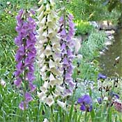
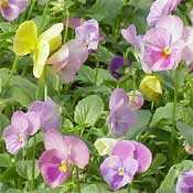
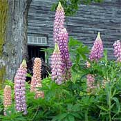
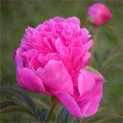
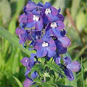
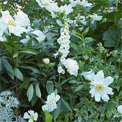
Let’s take a look at some popular perennial plants, and see how different color combinations can set different moods. Pastels. Soft pink, powder blue, lavender, and peach -- these gentle colors set a mood of tranquility. They are familiar colors of cottage gardens, those English-style gardens that contain a carefully designed hodgepodge of old-fashioned flowers. Pastel colors look best when viewed from relatively close up, and they can looked washed out in the harsh mid-day sun.
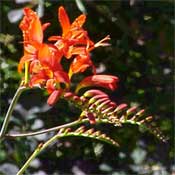
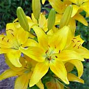
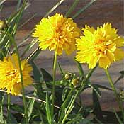
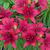
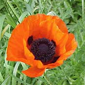
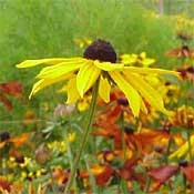
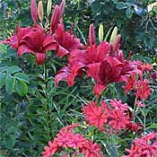
Brights. Racy reds, vibrant oranges, magenta, and sunny yellow -- these colors invigorate and energize a garden. Bright colors hold up well to brilliant sunshine, and attract the eye even from a distance.
Complementary colors. You may remember the color wheel from your school days. Colors that are opposite on the color wheel are described as complementary. High in contrast, complementary colors add creative energy and vitality to a garden. Examples of complementary colors include yellow and violet, orange and blue, and green and red.
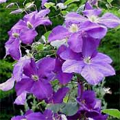
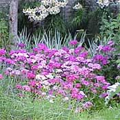
Harmonious colors. These are colors that are next to each other on the color wheel; examples include blue and violet, orange and red, and orange and yellow. These color combinations tend to be gentler on the eye than complementary colors. A harmonious color scheme unifies a garden, while allowing enough range of color that it doesn’t become monotonous.
If you are concerned about your ability to choose colors, a harmonious color scheme might be a good starting point for you. Unlike complementary colors, which can seem jarring and can give a riotous feel to a garden, harmonious colors are a pretty safe bet. As you gain confidence in your design eye, you can always add splashes of a complementary color here and there to liven things up The monochromatic color scheme. You may have seen gardens composed of all white flowers, and indeed some of the world’s most famous gardens use a monochromatic color scheme. Instead of relying on different colored flowers, the gardener creates interest by using a plants with different sizes and shapes of flowers, and chooses foliage with interesting textures and colors. Perhaps you are partial to a single color such as yellow. You can create varying moods depending on whether you choose soft pale yellows or bright sunny yellows or deep golden yellows. Or you might use a mix of shades! |