
So, I have been using Irfanview to edit digital pics and I'm struggling with how much of this editing business is really necessary or even an improvement to images. I'm not technically proficient and wouldn't really know how to begin with custom adjustments... so I'm using auto this'n'that. I'm sure I mentioned it before, but I'm still unresolved as to whether hitting "auto-adjust colors" is a good idea. Help!
Here are some before and after images. They are all resized/resampled to reduce file size, but other than that the only difference is the application of auto-adjust colours. Which is better?
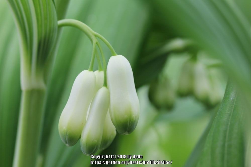
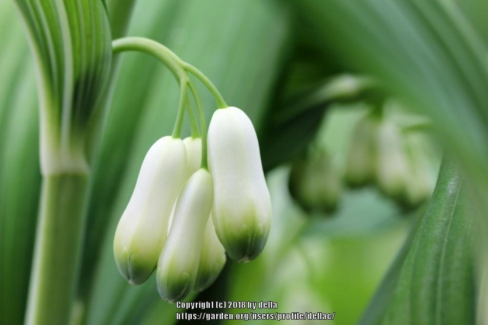


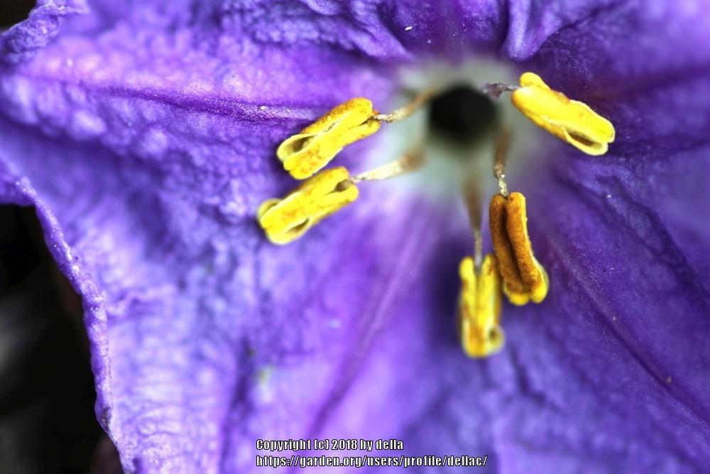

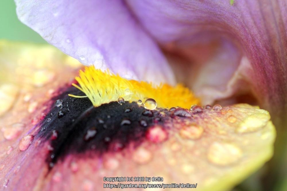
I have a hard time liking the adjusted images - why?
Hmmm....
Even though I think the auto-adjusted images are often (not always!) closer to the colours I was seeing with my eye, I also feel as though they are too garish. Are they, in fact? Or is this feeling a product of seeing the raw image first and having that imprinted as the 'real' image. If no one saw the raw image, would they find the adjusted one garish? Are we all just so used to seeing digital images that are made to 'pop' that we expect images viewed on screen to be super-real?
Or maybe it's a sensory perception thing - a kind of aversion to things that are 'too bright' for the individual? Are they too bright for anyone else? And yet, bright does not automatically equate with harsh. Maybe the quality shift in question is soft to harsh. Because bright alone is not a problem... in fact I would love to capture bright, luminous, true colour. How does one do that? Is it something captured in the raw image or a product of sophisticated editing?
Oops - that's a tangent! So, to pop or not to pop? Or opt for soft pop? woah... that was pop corn. If you're still reading, sorry! If you can tell me your taste in pic-pop, a gracious thank you.
Discussions:
| Thread Title | Last Reply | Replies |
|---|---|---|
| Photos by plantmanager | Oct 31, 2018 4:50 PM | 5 |
Post a new thread about this blog entry: